|
Just because you love someone or something doesn't mean you shouldn't be critical of them. If anything, I think it means you should be more honest with them because you care so much and don't want to see them struggle.
I care about the New England Patriots. I understand that losing the greatest quarterback of all time to one of the biggest joke organizations in all sports can make you do crazy things, but their post-Brady unis are terrible. I've hated them since I first laid eyes upon them. 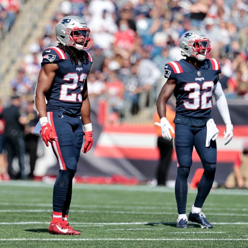
I've compared the change to when a woman gets a drastic (usually bad) haircut after a breakup, but at least the hair will grow back. The Pats are stuck with these until they decide to switch it up.
The Patriots current home threads are bottom-tier NFL uniforms (like the Jets). The all-blues are trash. They look like Violet Beauregarde. But it's not just the blue on blue; it's the numbers. I don't know how else to say it other than they're ugly to me. When the Patriots started wearing all-blues again for color rush in 2016, they used the same numbers and font as their regular uniforms. 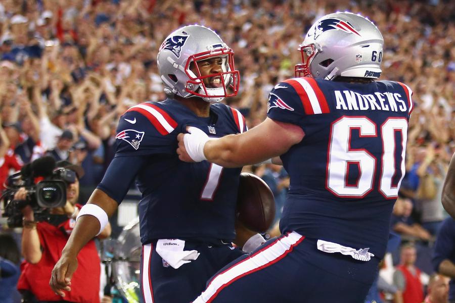
It's just a minor tweak that some might not even notice, but now they're worse than they were in 2016. They don't look like NFL quality uniform numbers.
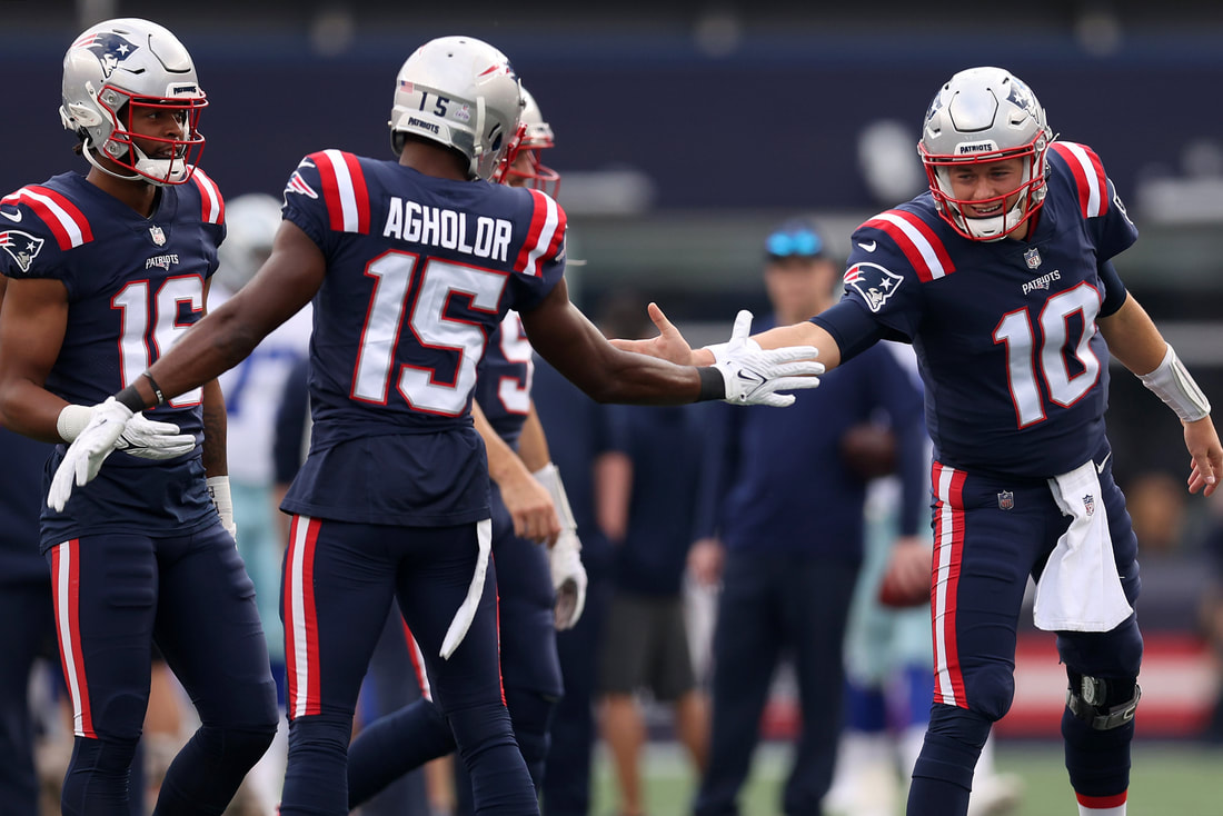
Last year vs. the Bills, Mac Jones and Josh Uche's jerseys resembled the Pats 2016-19 color rush uniforms, while the rest of the team wore their current digs. This image below shows the difference. You can see Mac's 10 and the 67 behind him are not the same number font. 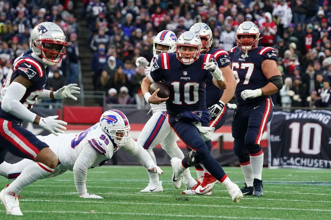
Another example:
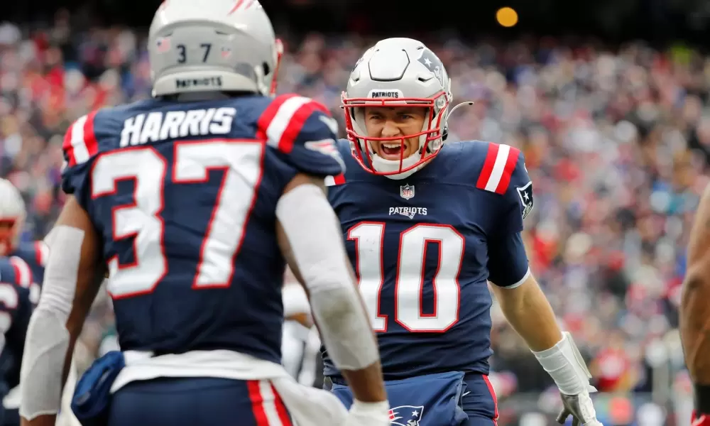
If you couldn't tell the difference, look at that 10 compared to this 10.
I get it, it's new era, and the Pats wanted a new identity, but these unis are objectively worse than their predecessor (there's no TV numbers on the sleeves either). With constant turnover in professional sports, you really are rooting for the uniform and I just straight up hate the Pats current ones. The Brady-era uniforms weren't elite, but they were solid, professional NFL uniforms. They weren't embarrassing, and with the Pats in the midst of a double-dynasty, they became synonymous with winning.
While the jerseys aren't changing (yet), it appears the Patriots are finally doing something to address their current threads. Silver pants are back??
I think we're gonna see these tonight and I'm excited. The pants won't make the shitty number font look better, but it'll be a major improvement from the disgusto-barfo blue on blue monochromatic look.
2 Comments
3
10/24/2022 03:20:29 pm
The numbers font is bad, the blue on blue is gross, but the worst part is the shoulder stripes
Dozie
10/24/2022 03:29:29 pm
I don't hate the stripes, they're a hat tip to the old Pat Patriots unis but I love the comment. The numbers are disgusto barfo. Leave a Reply. |
Archives
July 2024
|
 RSS Feed