|
Spoiler Alert: I'm the man behind the ultra-popular (2012-2014) Twitter account @URIprobs. During its peak, I had essentially 6,000 followers and was the semi-anonymous voice of all that was wrong with the University of Rhode Island, from parking to pike to the lack of an on-campus bar on account of being a moist campus.
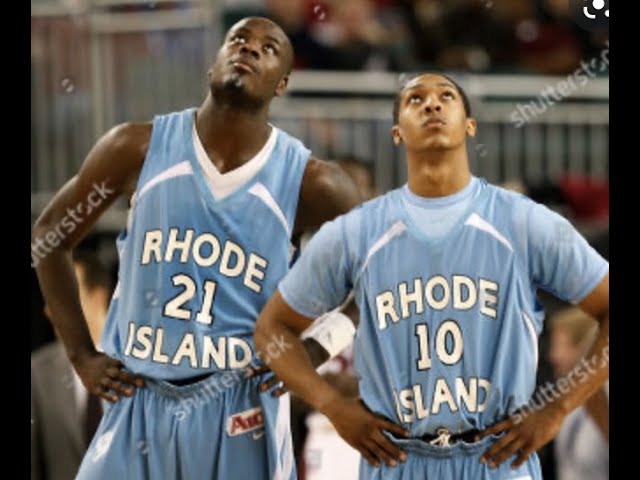
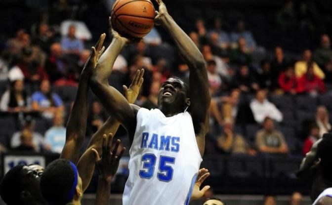
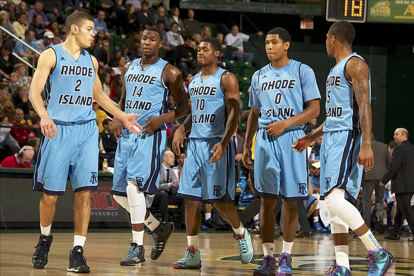
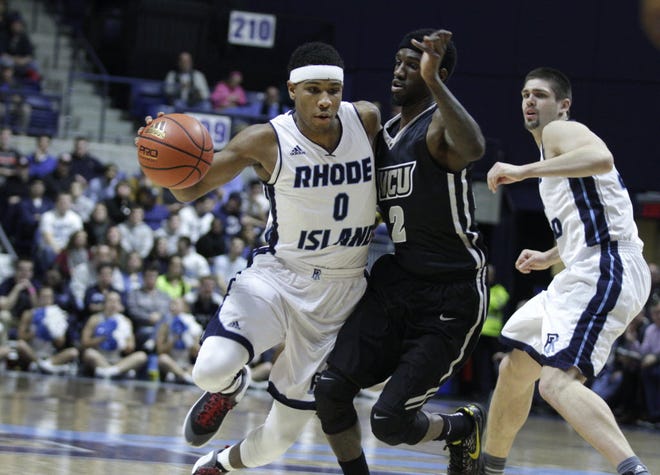
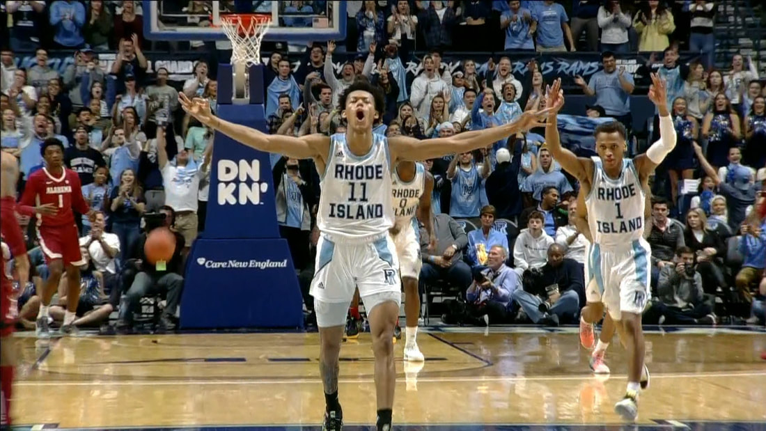
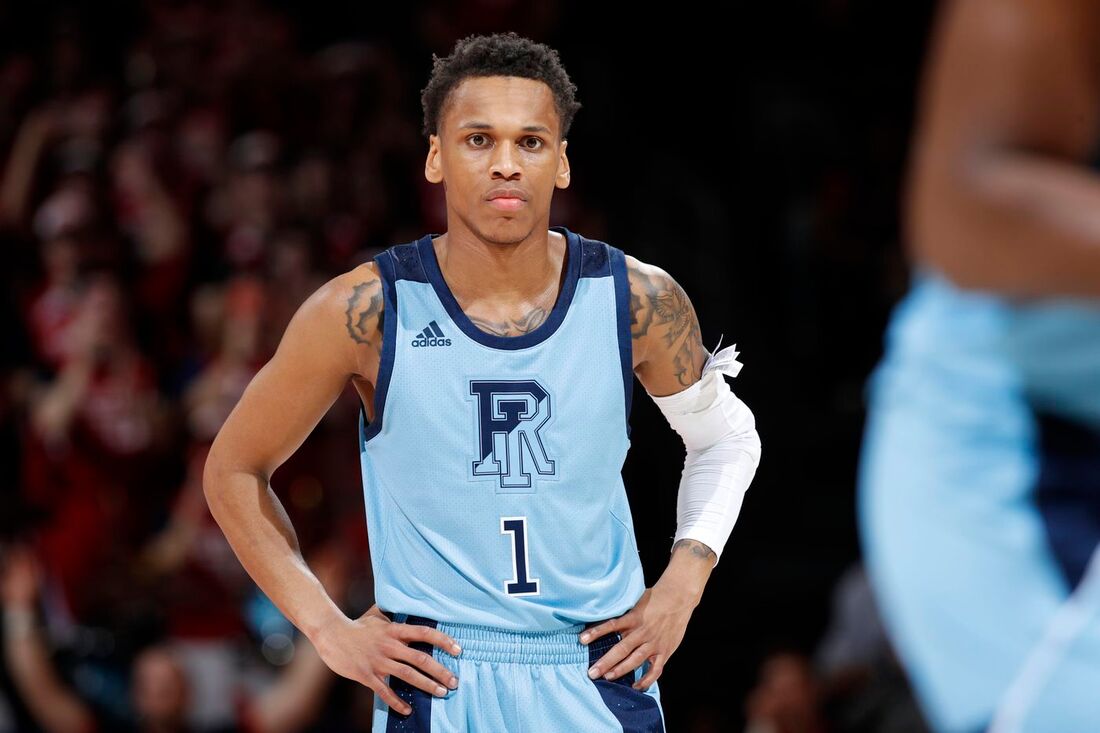
There's a lot to love about the University of Rhode Island, and I'm sure if I didn't grow up 12 minutes down the road, I would've better appreciated my time there, but I just wanted more out of my school. One of the biggest embarrassments during my five years as a student were the athletic programs. URI Football went 0-12 my junior year and 1-11 my redshirt senior year. URI is so poor/cheap that they field the bare minimum of men's teams to keep D1 status. No hockey, wrestling, lacrosse, etc. Because of this, there was next to no school spirit or buzz on campus like I imagined at "real" schools. The one URI team I sort of care about is men's basketball. The Hurley era was frustrating, but at least we went to the big dance twice, winning a game each time. Unfortunately, since he's left, it's back to the same old mediocre URI (although they had a chance to make the dance in 2020 before it was cancelled). One of the major problems with URI basketball (apart from their inability to run an offense since Jimmy Baron) is their lack of identity from a uniform standpoint. Outside of Rhode Island, unless you're a die-hard A-10 fan, you're probably not going to recognize them. I know teams in college switch up their look much more frequently than the pros, but URI hasn't been able to find its signature look. They're constantly tinkering with everything. Here are some examples of URI's less than stellar threads over the years.
THE WORST
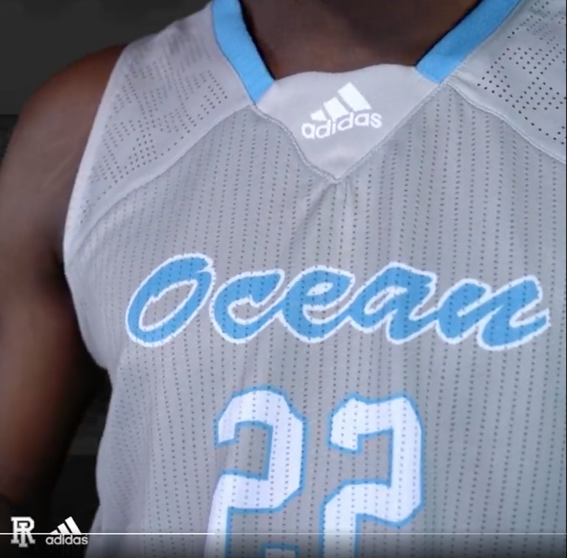
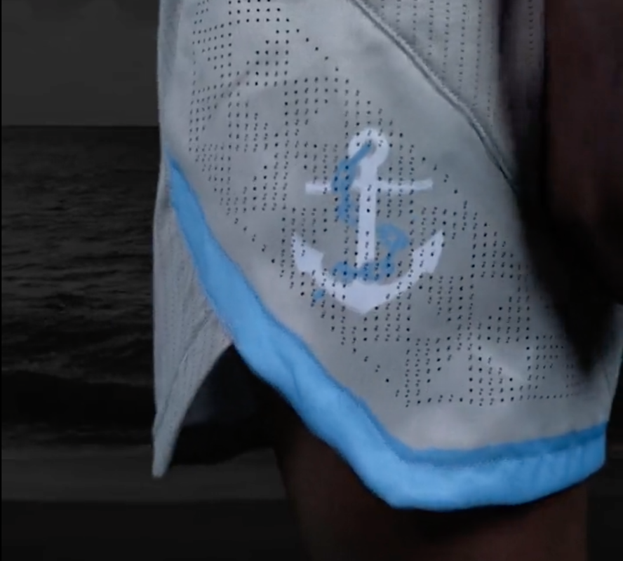
Today, URI announced new uniforms they're wearing tomorrow vs. Richmond, and I've seen better practice jerseys at underfunded middle schools!
Oh cool, groutfits! I'm sure that was the cheaper option. That probably would explain all the holes; anything to cut costs, amirite? If you wore that jersey outside you'd have a chicken pox tan line. AAU teams have higher quality digs.
It's not 1983. There's sweat-wicking technology readily available, you don't have to resort to tear-away unis like Earl Campbell. And don't even get me started on that font. What is with that font? Since when are backwards 7s the same as T's? The "O" in Ocean State is smaller than everything else. At least that's just the promo and not the actual jerseys.
The name and numbers are screen printed. How did someone sign off on these? They look so cheap. It's like these are the Bob's Store version of a better uniform. I honestly don't even hate the concept. I think it's cool to incorporate the Ocean State moniker like how Long Beach St. has "The Beach," but the execution was botched worse than Sponge Holton's career. These fugly uniforms are a #URIprob.
1 Comment
Dear Sir,
Reply
Leave a Reply. |
Archives
July 2024
|

 RSS Feed